We’ve kicked off the Open edX Theme by OpenCraft project by requesting feedback from the Open edX community.
Please join in the discussion at this thread to help get the conversation started. The more we discuss the project on the official forum, the more visible the initiative will be. Hopefully we can encourage others to give a hand and contribute, too!
Wow, that’s an awesome document @Ali! It is so good to see that this track is going on as well! Before jumping on the document and the discussion, do we have a ticket related to this task where we could log time?
Hey @team, as we didn’t get much useful feedback yet, we’re looking for specific clients to interview.
If anyone knows of any of our clients that have made complaints about the default Open edX theme, or you think would have some useful insights about theming, please let us know about them on the JIRA ticket.
We’re still on our quest to make online learning platforms more fun and engaging! We’ve turned to some existing sites for a bit of inspiration, and would love to hear your honest opinions about our ideas.
Check out @mtyaka’s most recent post on this thread, and join in the discussion.
I took a look at all the pages. Looks very clean and nicely spaced too. A couple of things I wanted to highlight
The borderless design feels more clean and comfortable to my eyes.
All the elements like buttons, progress bars and tab highlights seem to have a border radius. But not the images. For some reason, I found it odd and my eyes kept trying to render them to me with some border radius (if that makes sense).
I like the sticky menu and you have mentioned the sections would be highlighted on scroll, that would be really nice.
Edit:
The images I mentioned were in the my courses page. It might be a personal thing. Because images without border radius in the Course detail page look totally fine to me.
I also prefer the version without a border. It feels more clean and I know the extra pixels saved will be useful anyhow.
I’m not getting the border-radius effect @tecoholic is. Concur with them that the sticky menu should highlight the section on scroll. Maybe it should also go up a little higher when scrolling down, since the logo would no longer be on top?
The themes look nice and seem an improvement over the default theme.
Some comments:
I don’t understand the meaning of a circled arrow (→) at the left side of „Our courses“. I assume that it’s either a button to scroll things, or a way to point towards something that needs attention (as in „start here“)
I’m surprised that the images are so large that only one and half courses fit in the screen. I like large images but they’re so large that it may cause a lot of scrolling
I like how the design isn’t overloaded with information. However, courses have a variety of information and it would be good to see real examples. Real examples have more options: many enrollment options, certificates, paid courses, already enrolled courses, …
I like the color scheme (turquoise). The second one will work but it’s hard to classify it: it’s not a light theme, it’s not dark; it’s a combination of white and black, with high contrast. I think it’s good to provide it, since many people will like the high contrast theme (2nd one) whereas others will like the soft one (1st one).
Both themes require the background image to be dark (otherwise the text would be illegible)
bright turquoise vs. light green border: I think it’s better with no border, or with some padding but no additional color. I think it’s not worth introducing a new color just for 1 purpose (the border). However, I don’t mind the black border if it doesn’t take too much space: it will be ok if for instance there’s padding just on large screens
at the course view there’s a play button (circled triangle), probably to play a video. But I find it confusing because it’s located in the center of the screen. If the video takes the full width of the screen, that position is fine, but then the left bar would either overlap the video or disappear (both weird). If the video player doesn’t take the full width, then the play button could look better a bit more to the right, i.e. in the center of the video player.
the circled triangle may be too subtle to communicate the existence of a video. The page has 3 decorative images and the student needs to realize that triangle isn’t just decoration but a button that will display a video. Compare it to the edX site (e.g.) where there’s a button with the words Play video.
It looks like the theme doesn’t support showing an organization logo over each course (like in this theme); I’m not sure if it’s intentional. Probably most Open edX users won’t require more than 1 organization
the user can see (and scroll through?) 1 or 2 courses here („Our courses“) but, after doing that, I don’t see a button to explore „more courses“ (the rest of the courses). The user would have to scroll upwards and click „Explore courses“, which is a weird feeling (it looks like having to backtrack and start searching again). Compare it with the Explore more courses button.
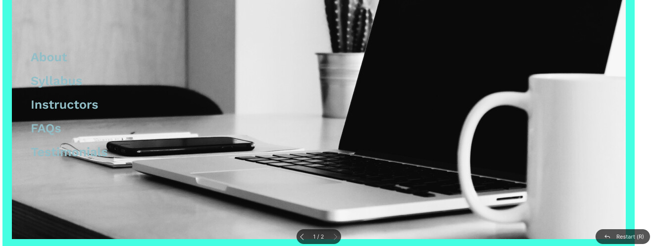
the left bar is static while the background moves. This creates many situations where the text is unreadable; see image below. I think that the current system passes some of the burden the user who customizes the theme, because he/she will need several attempts to make the images and text colors readable in any position. I’d like the default color+images to always fit, in any position, but I don’t know what would be best for that; a text shadow? text contour? background box?
Thanks @daniel, @Fox and @tecoholic. Would you guys mind it if I post your comments to the Open edX forum for you? Or if you have time, can you repost your comments there?
If we can keep all posts there so the community can see the involvement, that would be great.
I’d need to wait until @tecoholic posted his since I reference his comment. Might be better for you to post for us, unless @tecoholic manages to port his first and I get to it right afterward