Hi everyone,
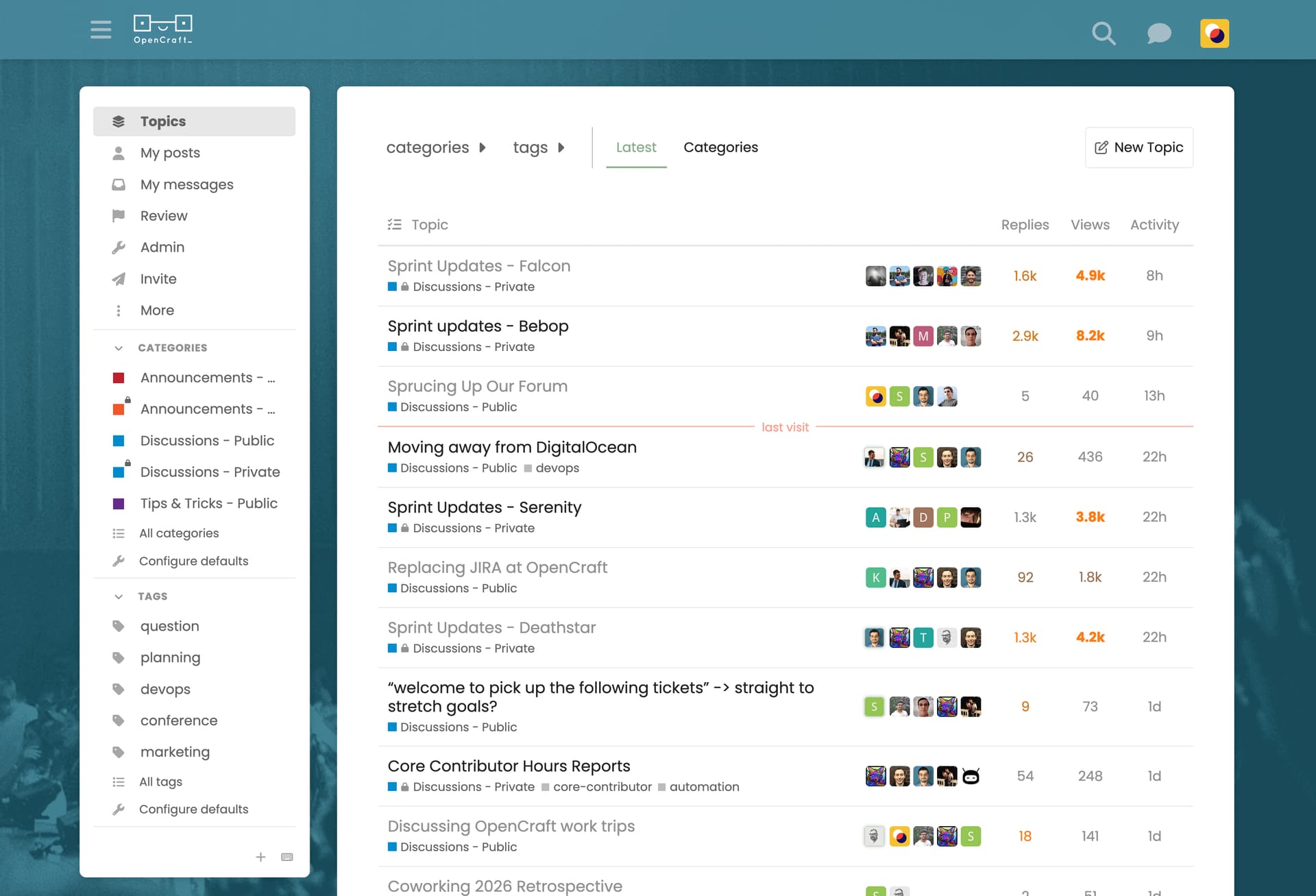
What would it entail to change the background of our forum? Is it just me, or does it kind of look like a religious congregation? 
It would also be nice to increase the size of the logo slightly so that it’s more legible.
What say you?
Hi everyone,
What would it entail to change the background of our forum? Is it just me, or does it kind of look like a religious congregation?
It would also be nice to increase the size of the logo slightly so that it’s more legible.
What say you?
It is possible to change the theme for yourself from your account preferences → Interface → Theme. I changed it to “Default” for me, because I also wasn’t a fan of the default “Graceful” theme.
I don’t know how or where the “Graceful” theme is managed though.
I like the new theme that https://discuss.openedx.org/ has - it’s clean and modern. 
Thanks, Samuel!
@gabriel, do you perhaps know where/how the theme is managed?
I also do, although I think the light theme works better than the dark one. Some of the text colours in the dark theme can be quite tricky to read.
Thanks for looking into this @Ali ! It’s true that it hasn’t been refreshed much since the initial installation, quite a few years ago now  It is indeed part of the website, and could use some attention
In the admin, at https://forum.opencraft.com/admin/config/customize/themes - and congratulations, you’re now a forum admin 
@antoviaque Thanks - I feel like I’ve just been knighted! 


I’ll see what I can do with the design and ask the team for feedback when it’s ready.
@Ali This the first time I noticed there’s actually people at the bottom  I thought it was just a gradient (which I know you and @cassie love).
 Your feedback, please…
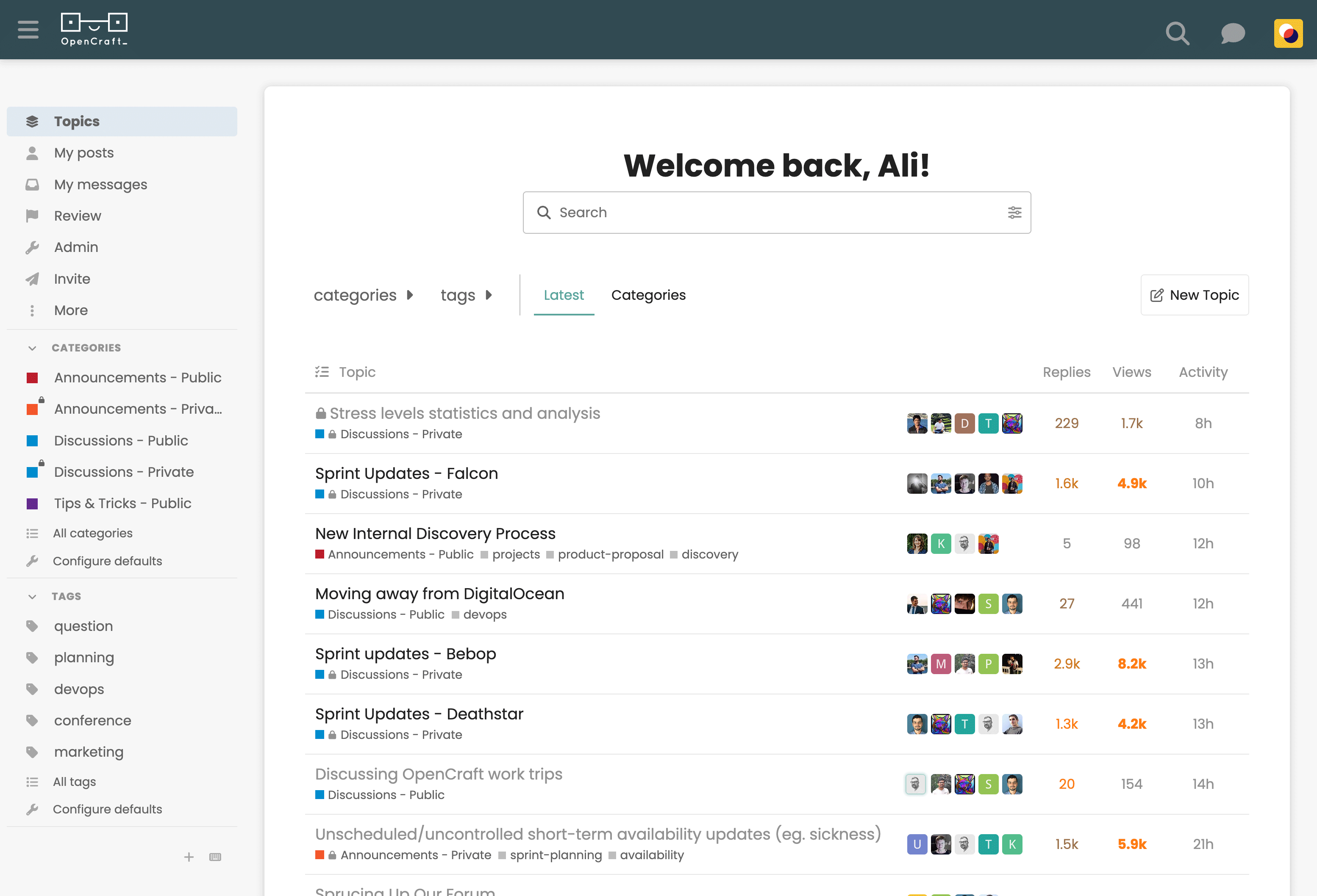
I’ve been working on a refresh of our forum theme and would like your thoughts before making it the default.
The idea was to keep the design clean and simple, since there’s already a lot happening in the interface. Once we’ve agreed on the light theme, I’ll create a dark mode version as well.
You can see a preview in the screenshot below, or take it for a spin by selecting “OpenCraft Light” under Profile > Preferences > Interface > Theme.
Let me know what you think.
The default fonts are a little big for me. But once I put the site on 90% zoom. It looks fine for my screen.
It’s a refreshing change. I like it.
@tecoholic Haha, I went back and forth on the font size because there is such a big jump between the sizing options “normal” and “smaller” (that said, I’m sure I could figure out how to adjust the base size in the CSS if neither works for us…)
I have changed it to “smaller” now. It’s a bit too small for me… I think. Somewhere between the two sizes would be ideal! 
Nice, I do like this a lot better!
Yeah the font is a bit small for me too. Perhaps we can keep it as the “normal” size, but change the font family to something that doesn’t feel as big?
Wait, my preferences had “smaller” as my font size preference. I’ve changed that back to “normal” and it’s fine for me. Not sure how that interacts with the font size in the theme itself?
I LIKE IT! 
I  it ! Already using it XD
Oh, yeah. This is way better. Much better use of space in my opinion.
Any chance we can get a dark mode while we’re here?
Love the new theme! 
These are the fonts we use across our marketing materials (website included), so I think we should keep them as the standard.
Ah, ok - so it looks like everyone can set their own font size preference from profile > preferences > interface > text size without affecting the default font size of the theme (which I’ve set to “normal” for now). CC @tecoholic in case you want to set yours to “smaller” in your settings (P.S. maybe that’s why you need glasses! )
This is next on my list!
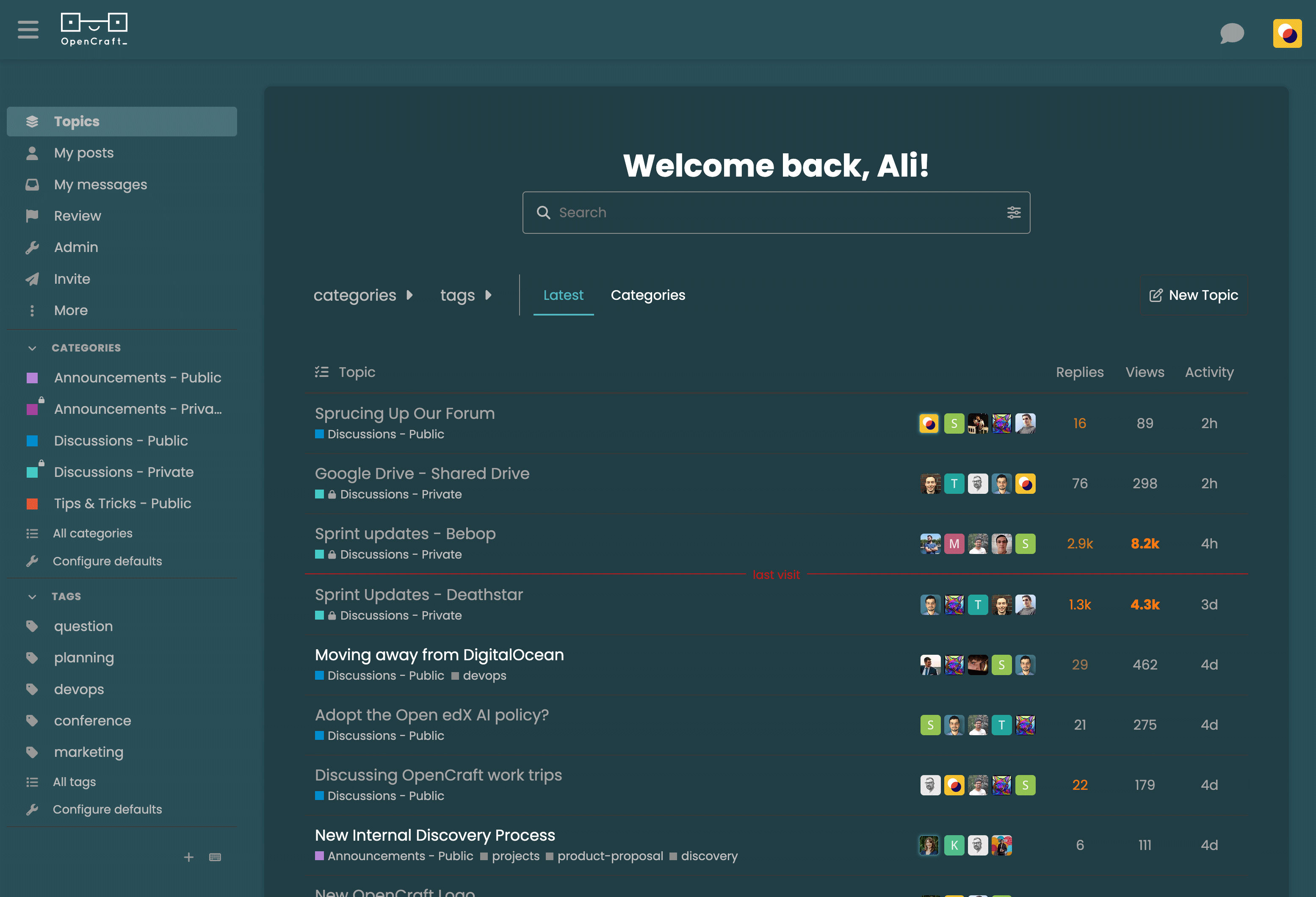
And, we have dark mode! CC: @Fox
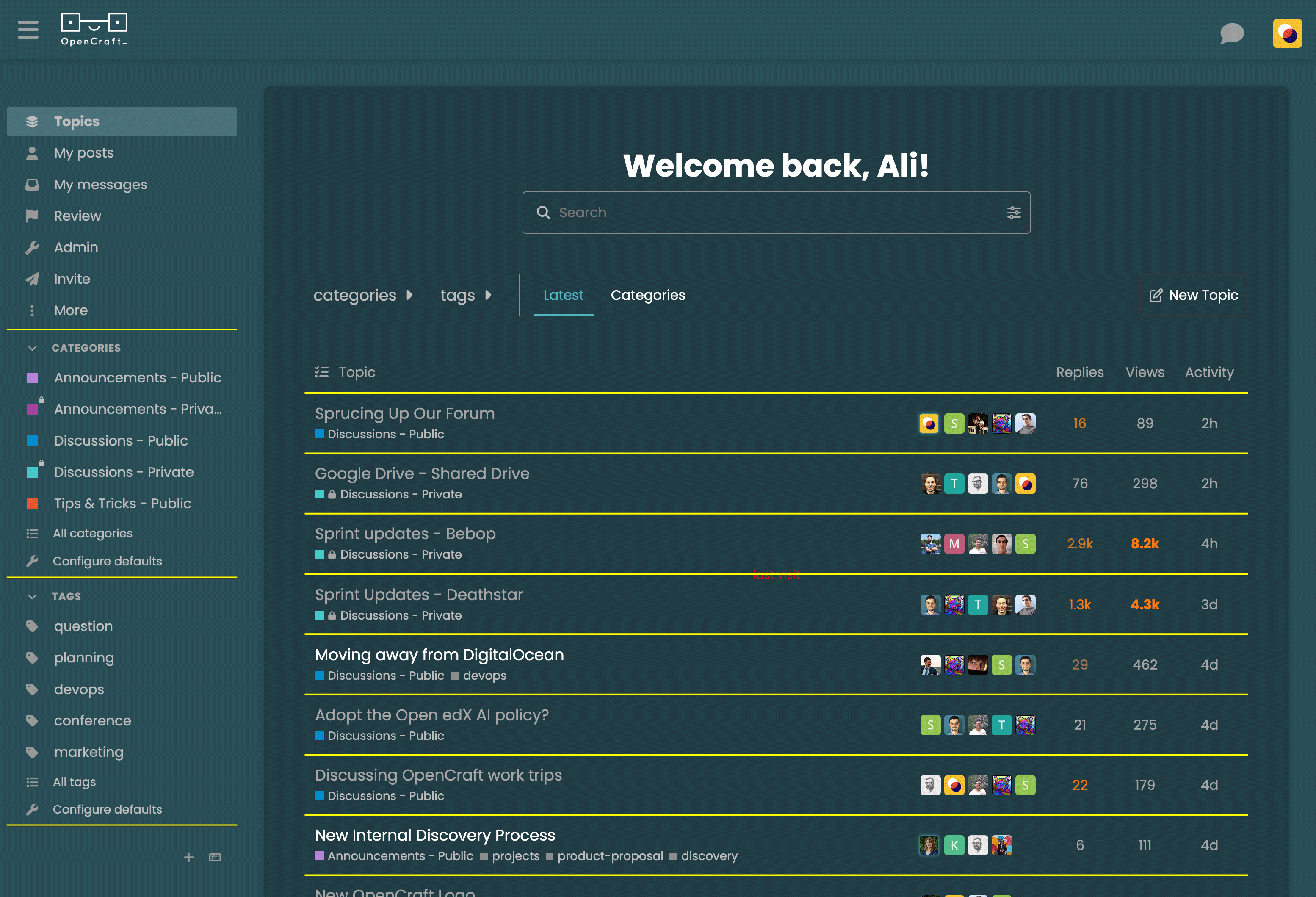
There’s just one detail I can’t figure out.
I’d like to change the colour of the dividing lines (highlighted in yellow in the image below), but only for the dark colour palette. The light palette looks fine as it is.
I can’t work out how to target those lines for just the dark palette. Ideally, I’d like them to be #FFFFFF at 10% opacity.
Could someone help me out, or point me in the right direction? Otherwise, I’ll could probably play around and add some disgusting CSS. 
I poked around briefly. Not sure if this helps, but the --d-sidebar-section-border-color variable is what sets the color of the dividers in the sidebar. That seems to be ‘dark mode section border color’, by the name of it.
The CSS for the topic division is:
.topic-map.--op {
  border-top: 1px solid var(--content-border-color);
  border-bottom: none;
  padding-left: calc(var(--topic-body-width-padding) + var(--topic-avatar-width));
}
--content-border-color doesn’t appear to be dark-or-light specific, though the color-scheme setting on the :root is dark. So you might have to write CSS for this one if there isn’t some direct variable to set in the theme settings. I’m willing to do this for you with a ticket, but this bit of research is about as much effort as I’m willing to put in without one :)
Ah nice, this is handy.
@Ali while you’re playing with the theme, would you be able to update the logo to the new one? See New OpenCraft Logo - #5 by cassie.